
Choosing the colour of a rug, in the light of the room
The light of the room, the purity of the wool, the palettes of our artists: how to choose the colour of a rug, from the green of SUR LE FIL to the stone tones of Christian Signorel.
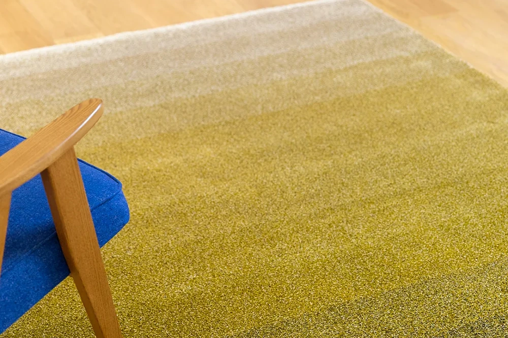
What colour is your living room at noon, and what colour at dusk? Choosing the colour of a rug begins there: with the light of the room and with what already dominates it, the floor, the walls, the sofa. The rug can extend that colour, answer it with a frank contrast, or become the starting point for the whole room. A green holds as well in a single field as in a camaieu of foliage. A pink is more often worked in touches, in a tinted metal, a cushion, a detail of the motif. A pale rug requires a wool pure enough to stay pale. At Diacasan, colour is the common thread of all our artists, from the paintings of Jean-Paul Espinosa to the stones of MINOTOR 2.0. The material then decides how that colour will live: hand-spun Himalayan wool, New Zealand wool and Tencel each take the daylight in their own way.
Start from the light of the room before the colour chart
The colour of a rug is judged in the light in which it will live. A north-facing room cools blues and greys beiges; a south-facing room warms ochres and can set a red ablaze. The same rug therefore changes its bearing between the showroom, where the lighting is studied, and the home, where the daylight turns around it.
The material accentuates this movement. Himalayan wool, spun by hand in Nepal, keeps a natural irregularity that catches the light differently according to the angle and the hour: the rug looks paler from one direction than from the other, and its shades shift through the day. Tencel, combined with wool in MINOTOR 2.0 and in VUE DU CIEL, brings a sheen that brings out the relief when the light is low. Viscose, finally, is the material of the white version of The Rose, whose light it carries.
Before choosing, it is therefore best to look at the room at two moments, in the morning and in late afternoon, and to note the colour that remains present in both. It is often that colour which should guide the rug.
Colour, the common thread of our artists
Each artist we publish has his own handwriting, but all of them pass through colour. Sandrine sums it up in a sentence, speaking of those she publishes: “the common denominator between them all, really, is colour”. This sentence explains why our collections are distinguished first by their palettes, before their motifs.
In PAINTINGS, the colour of the canvas becomes the material of the rug. Jean-Paul Espinosa recomposes fragments of his paintings, hand-tufted in India. Colorful sets its chromatic masses side by side, without transition, and it is this frankness that makes the piece. Everglades evokes the horizontality of a marsh, water, tall grasses. These rugs are made for homes where there is space, where colour can occupy a territory on the floor without being squeezed between furniture.
In MINOTOR 2.0, the palette comes from stone: Argile, Azurite, Calacatta, Emperador, Levanto, Onyx. Each rug carries only two colours, and the relief does the rest. The artistic director wanted this restraint to answer clients who arrive at the showroom saying, more or less: I would like blue, or green, and I already have the dimensions.
Green, from the botanical to the garrigue
Green is one of the most varied colours in our collections. It ranges from bright green to olive, from fresh foliage to undergrowth.
The first version of Percée, in SUR LE FIL, was worked on the primary colours: red, blue, green, and a little yellow, before the palette softened. Percée Vert keeps a botanical freshness from it: the motif breathes like a leaf, through the spaces between the lines. Percée Tapenade leans towards olive and the garrigue, a southern colour held by the engraver's rigour. Both are hand-knotted in Nepal, in hemp and Himalayan wool; the hemp forms the weft, the wool carries the colour.
Rizière, from the VUE DU CIEL collection, shows another green: plots ranging from olive to deep green, cut into flat fields on an ecru ground, crossed by ochre furrows. Sophie Tolachides, photographer and geographer, reads terraces seen from above in it. This green goes with pale woods, with linen, with white walls, and suits a bright room very well.
A green rug asks for little around it. It calls for natural materials, wood, stone, leather, and accepts a second frank colour provided it remains in the minority.
Pink, in touches rather than in fields
Pink occupies a place apart. Searches for pink rugs are numerous, and yet this colour is rarely worn across the whole surface of a floor. It works better in touches: a reflection, a metal, a detail that warms a more neutral room.
In our collections, pink passes first through tinted metal. The Mircur mirror, designed by Christian Signorel for MINOTOR, exists in Or Rose, a shade that leans towards the warmth of sunset without tipping into glitter. The Scarab triptych mirror from BESTIAIRE also carries an inner mirror tinted Or Rose, in a frame of engraved walnut. Hung above a rug in earth or stone tones, these mirrors give pink its right measure.
The most celebrated rug of PAINTINGS, The Rose, is not pink at all. Its name came afterwards, because its flashes of paint could evoke a flower; it exists in white and in black, in wool, Tencel or viscose, to be chosen according to the use and the light of the place.
Pale, colourful or two-toned: what the wool allows
A pale rug depends more on the purity of its wool than a colourful one. New Zealand wool, used for tufting in India, is very pure: pale colourways stay pale, without stains. European wools, of fine quality, require particular vigilance on whites and ecrus. The founder also warns against what she calls dead wools: rugs that turn grey after a few months, as if the colour were dying out. Our article on Himalayan wool and New Zealand wool details these differences.
Hand-knotting, for its part, sets the colour during its making. The washes and finishing operations remove impurities; afterwards, the colour no longer moves, and the rug acquires a patina. This is one of the reasons why knotting lends itself so well to nuance.
Blue, finally, has a place apart with us. It returns in the cobalt of MINOTOR and in many pieces, and our article devoted to blue tells its story.
Holding together the rug and what surrounds it
A rug lives with what surrounds it. The cushions, poufs, curtains and other rugs in the room must be able to look at it without contradicting it. The safest course is to stay within one collection, because its colours were conceived together. Mixing BESTIAIRE and MINOTOR, two collections by Christian Signorel, remains possible, but their colours do not necessarily go together, and that was intended: each collection explored its own palette. The pairing is judged piece by piece.
The same care applies to objects. A GRAND NORD cushion placed on a sofa does not have the same blue as another blue rug in the room, and the eye notices. Our article on cushions, poufs and mirrors shows how to take up a colour of the rug at another height.
“Blue is the horizon, it is the sky, it is the sea, it is the ocean.” So speaks the publisher of blue, and the sentence suffices.
Text written by Diacasan Edition from interviews with Sandrine Demas, the records of our collections and exchanges with our workshops in Nepal and India, October 2026.
Questions fréquentes
Which rug colour goes with a grey sofa?
Grey leaves the rug free to carry the colour of the room. One can stay within stone tones, with a Calacatta or an Onyx from MINOTOR 2.0, for a calm and graphic living room. One can also make the rug the focal point of the room, with a bright green, an ochre or a composition as assertive as Colorful from PAINTINGS. The criterion remains the light: a cool grey in a north-facing room gains from being warmed by a wool in warm tones.
What goes with a green rug?
A green rug goes with natural materials: pale or dark wood, linen, stone, leather. It tolerates a second frank colour if it remains in the minority, an ochre, a brick red, a blue. In our collections, Percée Vert and Percée Tapenade from SUR LE FIL, hand-knotted in Nepal, cover botanical green and olive green; Rizière, from VUE DU CIEL, renders greens in flat fields on an ecru ground. White walls and a bright room show them at their best.
Is a pale rug a good idea?
Yes, if the wool is pure enough to stay pale. New Zealand wool, used for our rugs tufted in India, keeps pale colourways clean, without stains. A pale rug visually enlarges a room and accepts almost any furniture; in return it asks for a place away from the busiest thoroughfares, such as the entrance. In a dining room or a corridor, a motif or a mid-tone colour lives more easily with daily life.
Does the colour of a wool rug change over time?
A quality rug keeps its colour and acquires a patina. In hand-knotting, the washes and finishing set the shade during the making; afterwards, the colour no longer moves, and over the years the rug takes on a depth one compares to that of a fine piece of furniture. The risk comes from lesser wools, what we call dead wools: they turn grey after a few months, as if the colour were dying out.
Can one choose the colour of one's rug?
Yes, in several ways. Each collection publishes its own colourways, conceived with the artist: the stones of MINOTOR 2.0, the colours of Percée in SUR LE FIL, the variants of PAINTINGS. When none suits, the colour can be worked within a project, from an existing design, with the workshop that makes the collection. The simplest course is to come to the showroom with a sample of the sofa, the wall or the floor, to judge the colour beside what will surround it.